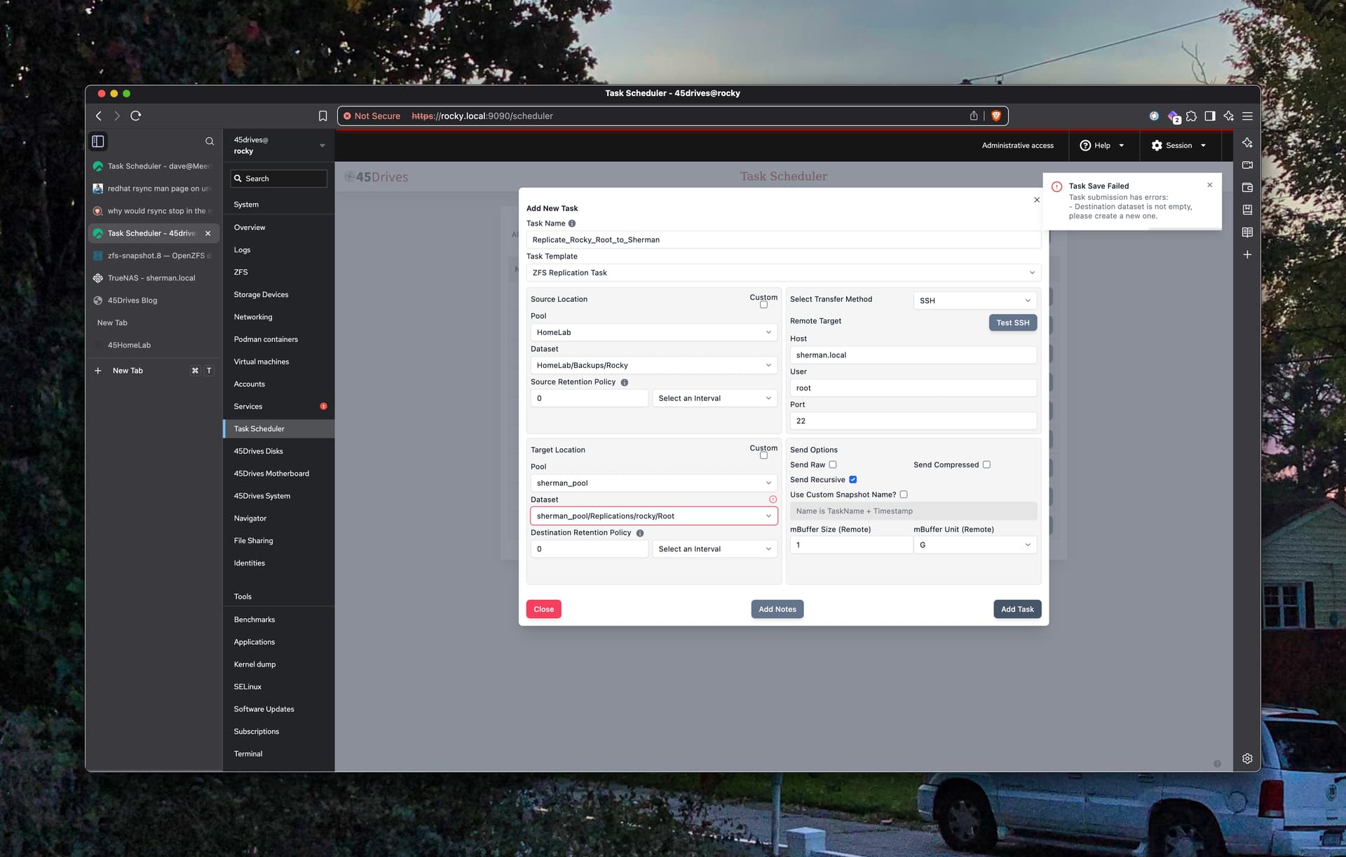
Houston UI Task Scheduler popup notifications are unreadable. The light gray type on charcoal background has too little contrast for older eyes. And yes, I have Tleilaxu eyes (I’ve had my cataracts fixed).
Here’s an example.
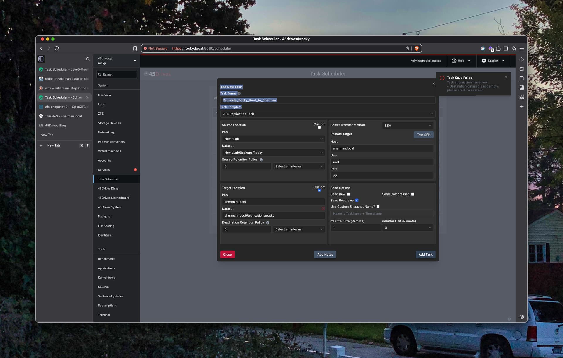
A second Houston UI issue. Setting aside a partially complete Task Scheduler item can cause the work completed to date to be lost. Sorting connections is somewhat hard as user guessing games are required. Just who’s cron is doing the work? Root, innit? Yep, ps -aux is your friend. This can be a bit tricky if the remote host uses daemon-users to do daemon things.
Dave